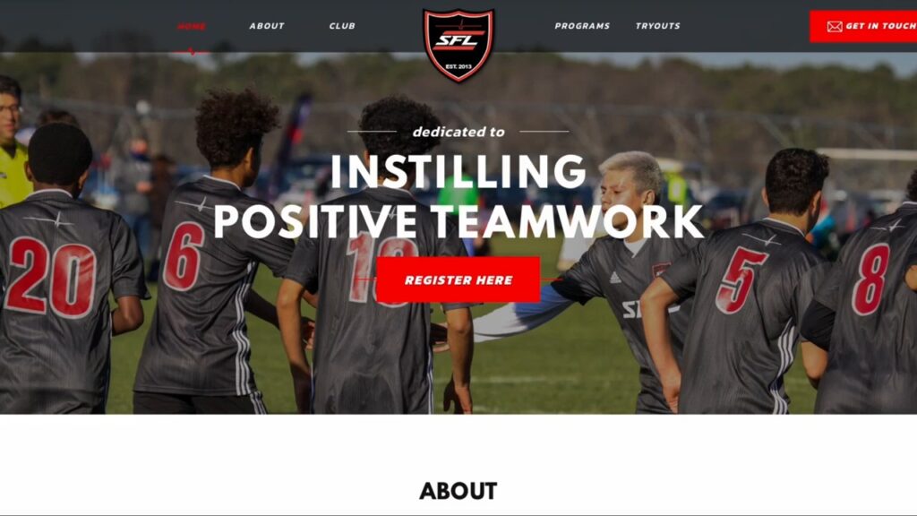
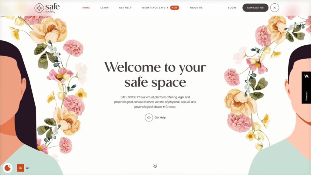
In this particular post, we’re focusing on the concept of “above the fold.” The term refers to the part of a website visible as soon as you land on the page without any scrolling.
It’s a carryover from the old days of newspapers, where “above the fold” referred to what you saw without unfolding the paper.
In this article, we’ll cover everything related to the above the fold in web design, including its uses, different design approaches, common mistakes, and statistics that provide a better understanding of its importance.
Before we dive into the specific uses of the above the fold, it’s important to recognize that this area of a website is premium content space.
It’s the first thing visitors see when they arrive, making it a crucial factor in determining whether they stay on the page or leave. Knowing this will help you be a better Kuala Lumpur website designer.
While navigation is usually the most important part of the above the fold, the primary use is to clearly tell visitors what the page is about and introduce the content.
For example, on an About page, this is straightforward, but the home page is different.
Instead of just stating “Home Page,” the above the fold on a home page should answer three key questions: who are you, what do you do, and how can you help me.
1. Start With Who Are You?

The first question, “Who are you?” is typically answered with a logo in the top navigation. The second and third questions, “What do you do?” and “How can you help me?” require a bit more content, usually in the form of text, often placed in a hero section.
This hero section usually contains a heading and supporting text, often alongside a background image.
As an example, my own website does this by answering all three questions right in the above the fold: my logo represents who I am, the heading explains what I do, and the supporting text clarifies how I help.
Other websites like NeoReach and Fountain TRT also execute this well, providing clarity right away.
However, some websites fail at this. Take WeSpot, for example: their ambiguous statement “We add, we exit” leaves users confused. Or another site that shows a article without any context—while the post might be relevant, it doesn’t give visitors any clear information about what the site offers.
These examples highlight how crucial it is to answer those three fundamental questions clearly.]
2. Include CTA

Beyond simply introducing the website, the above the fold can also serve other functions like including a call to action (CTA). Many websites feature buttons in this area to encourage users to take action, such as contacting the business or signing up.
Promotions and time-sensitive content can also be featured here, though using sliders or overly intrusive banners can negatively impact user experience. Financially, this space can be valuable for ad placements, but again, this must be balanced carefully to avoid disrupting the user experience.
3. Effective Above The Fold Design

As for design, the most common above the fold layout is a background image with text overlaid, but there’s plenty of room for creativity. You can break traditional layouts with visually interesting designs, as seen on sites like Dual.eu.
Even within a structure that follows the “three questions” rule, you can design something unique that stands out. It’s important to note that while design is subjective, following best practices—like ensuring contrast between text and background—will help maintain usability.
When designing an effective above the fold for a home page, start with a clear heading, one to three sentences of supporting text, and a CTA button. You’ll need to decide between using a background image, solid color, or even a video.
If you’re aiming to emphasize the content, a solid color is best. For a more emotional or impactful presentation, an image works well. Videos, on the other hand, are more daring but can be tricky to execute well without sacrificing usability.
For sub-pages, a simpler approach is often better.
4. Consistent Title Bar
A consistent title bar, either left-aligned or centered, can help users understand the page easily.
Some sites prefer to create custom layouts for different sub-pages, which can work as long as it’s still easy for users to scan for the title.
5. Breadcrumbs
Breadcrumbs are another useful addition for sub-pages, especially on larger websites, to improve navigation and user experience.
Mistakes in the above the fold are common. One of the biggest errors is failing to answer the three essential questions.
6. Watchout for False Bottoms

Another frequent issue is creating a “false bottom,” where users mistakenly think there’s no more content to scroll down to because the section takes up the entire screen.
Avoid making your above the fold taller than 80-90% of the screen.
7. Video Backgrounds
Video backgrounds can also be problematic when not done right—if the video relies on audio or is too visually distracting, it can harm the user experience.
8. Contrast Between Texts & Background

Finally, not having enough contrast between text and background can severely hinder readability, which is an issue many designers face, especially when trying to balance aesthetics with functionality.
Now for some statistics: A 2010 study by NN Group showed that 80% of people spent their attention above the fold. However, things have changed since then.
A more recent 2018 study revealed that 57% of users still focus above the fold, but they now spend their attention across the first two to three screenfuls, showing that while users do scroll, they prioritize the top of the page.
This highlights the ongoing importance of designing a compelling and effective above the fold.
In conclusion, I hope this article has provided you with valuable insights into the importance and design of the above the fold. If you’re looking to improve your web design skills, check out my other articles.


0 Comments