Because footers are at the bottom of websites, they’re not exactly something we, as Penang web designers, really ever think about. But, footers can actually be pretty interesting; in fact, they can be a pretty broad topic- depending on the design, it can enhance the user experience and increase conversions; even affect SEO.
In this article, we’ll cover everything from website footers so that we can do better for future websites and improve existing ones.
We will start with a discussion of different uses and types of footers, followed by various designs and how I personally create them.
Further on, we will cover how to make them more useful with user experience and conversion in mind, followed by statistics proving their effectiveness. Last but not least, we dive into SEO impact of footers, especially for website agencies.
Why We Have Footers

Now let’s get on with the why behind footers. In all, two critical uses for footers: as a last-ditch attempt at finding content that can’t be accessed through the main navigation.
The other important use for footers is as a second chance to convert users, which we’ll explain later. It’s worth mentioning that a few sites don’t include footers because they believe it makes them look trendier, cleaner, or something equally buzzword-y.
But this can result in poor usability, not to mention other negative consequences of bad usability.
Adding a footer isn’t just best practices-footers actually have a very real impact on website conversions and click-through rates. There are three types of footers: normal footers, infinite scroll-or mini footers, and contextual footers.
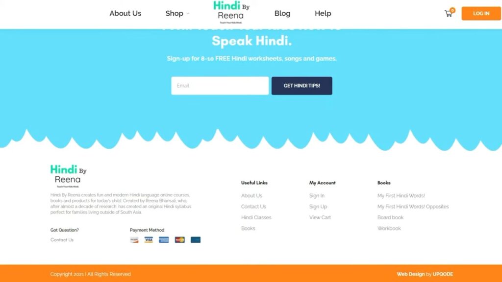
Normal footers are the most widely used; an example of a typical normal footer would have links and information that remain constant between pages.
Infinite scroll footers are much rarer, and usually occur on social media feeds; you see them in the sidebar, for the simple reason that an infinitely scrolling page could never reach the bottom.
Contextual footers change depending on what page or status of the user is, such as signed in or not.
Footer Designs

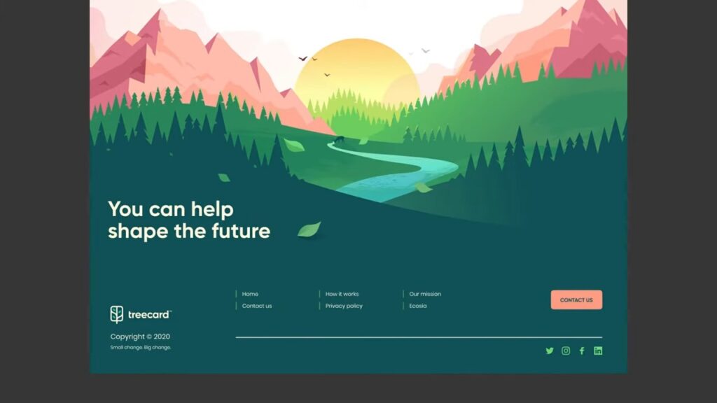
When it comes to design, footers are available in many flavors: small, large, light, dark, minimalist, illustrative, and many others.
The design of a footer depends on the general design of the website and the size of the business it represents. For example, compared with a giant like Amazon, a local coffee shop with a small site will have a much simpler footer.
Personally, when building footers, I use a four-column layout: the bottom section marked for copyright and other privacy policy information. First column:
About the company, the logo, and a quick blurb about what this company does-this is for user experience to quickly communicate who you are. The second column includes links from the main navigation plus extra pages that make it convenient for users to find what they need without scrolling back up.
This practice is sometimes referred to as “doormat navigation.” Third column calls to action, such as services or products, take advantage of users already committed enough to have scrolled to the bottom.
The fourth column holds contact information, a web design standard. This column would hold an email address, physical location, and a phone number and sometimes links to social media for convenience.
Usefulness of The Footer

If you need design inspiration for footers, Pinterest is a great source for all things web design. Clear labeling for your links will be very important in making your footer useful.
For instance, using some terms that are vague, such as “resources,” does not tell the average user much; naming it more precisely, labeling it “blog” or “articles,” gives a better user experience. Awards can be effective toward credibility if subtle, and Instagram feeds can be great for visually inspired brands.
But I wouldn’t suggest putting Facebook or Twitter feeds unless it’s content valuable to users; otherwise, it tends to make a site look dated. Last but not least, a newsletter sign-up section is very common in footers and thus serves as an easy location for users to subscribe.
Case Studies on Website Footers

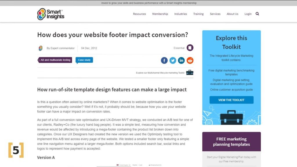
Specifically, to date, there are a limited number of studies on the best design for a footer. However, two major ones are very noteworthy: First is an A/B test conducted by SuperOffice.
By adding call-to-action buttons to their footers, they realized a 50% increase in conversions. Also, Smart Insights did an A/B test for Radley London, an e-commerce site.
This involved upgrading from its minimal footer to a mega footer that showed product categories and subsequently resulted in a 24% increase in sales.
Footer Impact on SEO

Now, let’s touch upon footers in terms of SEO. It can have a pretty big impact on SEO in terms of click-through rates with internal links. Footers are also an excellent place to show some credibility items such as phone numbers, addresses, email addresses, social media accounts, and awards.
All of these will show off your expertise, authoritativeness, and trustworthiness, also known as EEAT, which stands for perhaps one of the biggest SEO factors out there.
Technically, the weight of a footer for SEO reasons may either be higher on the homepage or on another page. The contextual footers are indeed worth consideration when it comes to SEO.
More importantly, it is important to avoid black hat SEO techniques such as hidden anchor text or spammy backlinks in footers, as Google frowns upon such practices.
For instance, if a website design agency has added into a link back to their site in a footer using keyword-focused phrases, it counts as black hat SEO. But there is no risk using only the brand name.
In all, footers may seem like an afterthought, but they are important for user experience improvement, conversions, and SEO too.
Now, let me know in the comments if there is some other aspect of web design you would like to learn about.


0 Comments