Logos With Hidden Meaning
There are logos with hidden meanings that can be made in just minutes and others that take weeks or even months to develop. You wonder why they can take so long to design if sketching and vectoring them can take just a few hours. What really takes time is the concept behind it, its meaning – or meanings – and what you want to communicate, whether explicit or not, with its shapes and colors.
As people who work in the creative field, we need to know those references and how it is possible to reach logos as part of branding in an effective way. For that reason and many more vectors, today we have for you a list of the 10 logos with more than one meaning that you have to know, so that you are inspired in logo design.
1. Unilever logo
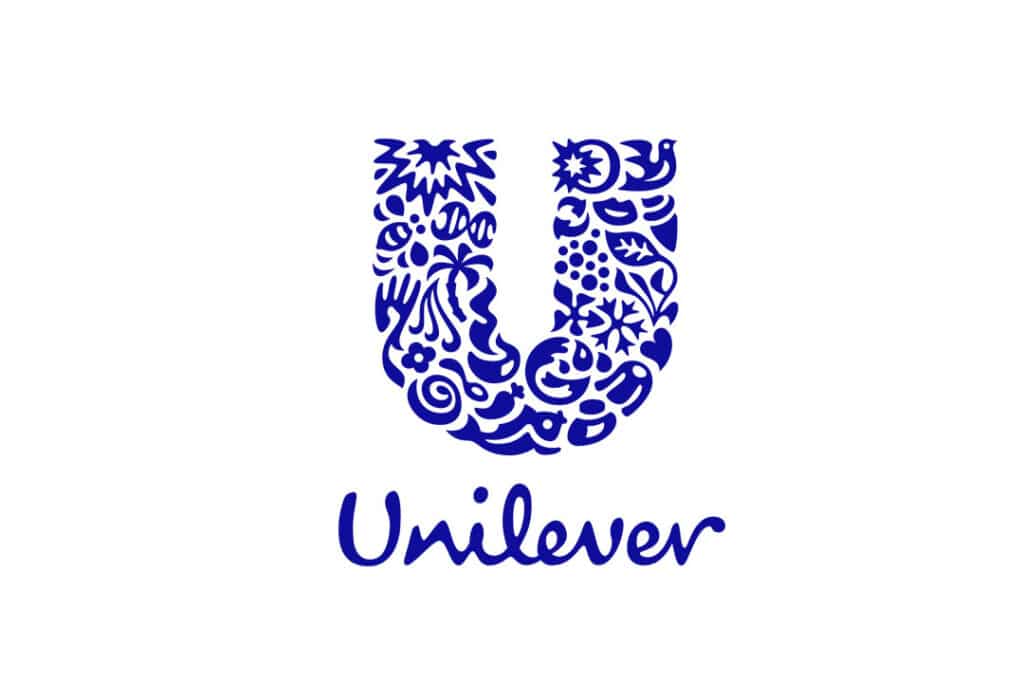
Since we see this logo, it is a bit strange to see so many objects inside the letter U. But did you know that each element has its own meaning ? This is one of the greatest logos with hidden meaning ever created.
Each element of this logo represents a brand commitment to the daily lives of its consumers , such as the food bowl, which symbolizes the dedication to providing excellent quality ingredients for the diet of its consumers.
Miles Newlyn, creator of the Unilever logo, had this to say about it: “The logo consists of twenty-five icons intricately woven together to form a U, replacing the old logo that had been used since 1970. Working with creative director Lee Coomber, we used a fluid creative process whereby we think about how and what Unilever does, while drawing. icons and the U simultaneously “.
Here’s what some of the most important elements of the Unilever logo mean .
Sun : The main natural resource, the sun evokes Unilever’s origins in Port Sunlight and can represent several of its brands: Flora, Slim-Fast and Omo use luminosity to communicate their benefits.
Bees: Represent creation, pollination, hard work, and biodiversity. In the Unilever logo design, bees symbolize both environmental challenges and opportunities.
Hand : Symbol of sensitivity, care and need. It represents both skin and touch and is linked to many Unilever product lines.
DNA: The double helix, the genetic model of a life and a symbol of bioscience. It is the key to a healthy life and it had to be present in the Unilever logo. The sun is the largest ingredient in life and DNA the smallest.
In this link you can read more about the history of the Unilever logo.
2. Logos with hidden meanings: Museum of London
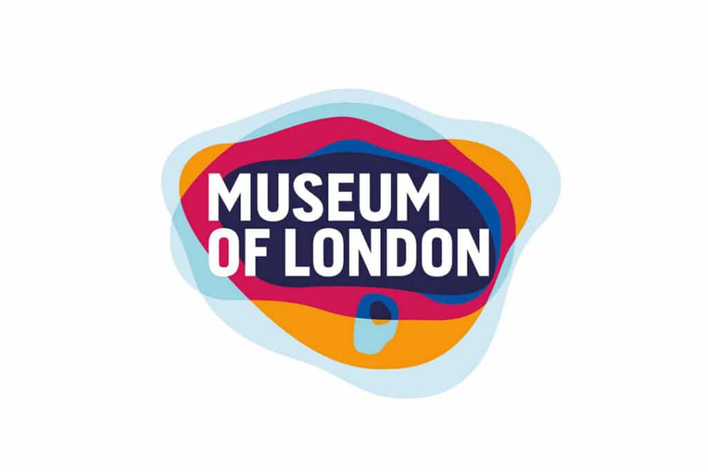
The London museum logo is a reflection of the historical reality of this city . As a logo, it’s amazing what it can teach you just by looking at it, as it sums up London’s geographic growth in one image. The lines that surround the text are layers that separate one geographic stage from another. Did you know that in the year after the logo change, visits to the Museum of London increased by 79% ?
With its avant-garde works and more than 2 million objects, the Museum of London has what it takes to be a world-class museum. However, when it first opened its doors it failed to capture the public’s attention.
When they sought out the services of the Coley Porter Bell design agency , visitor numbers were declining at a time when museum visits in the UK were on the rise. The creatives at Coley Porter Bell had to figure out how to bring the brand to life to make the Museum of London relevant and interesting to visitors from around the world.
The logo created uncertainty and intrigue about the content of the works exhibited in the museum. The museum obtained the necessary financing to remodel the most important galleries, but it needed a new positioning and identity that would serve it strategically to attract visitors.
Another goal of the logo design was to generate awareness about the museum and to get people interested in what was exhibited inside.
3. Logos with hidden meanings: Toblerone
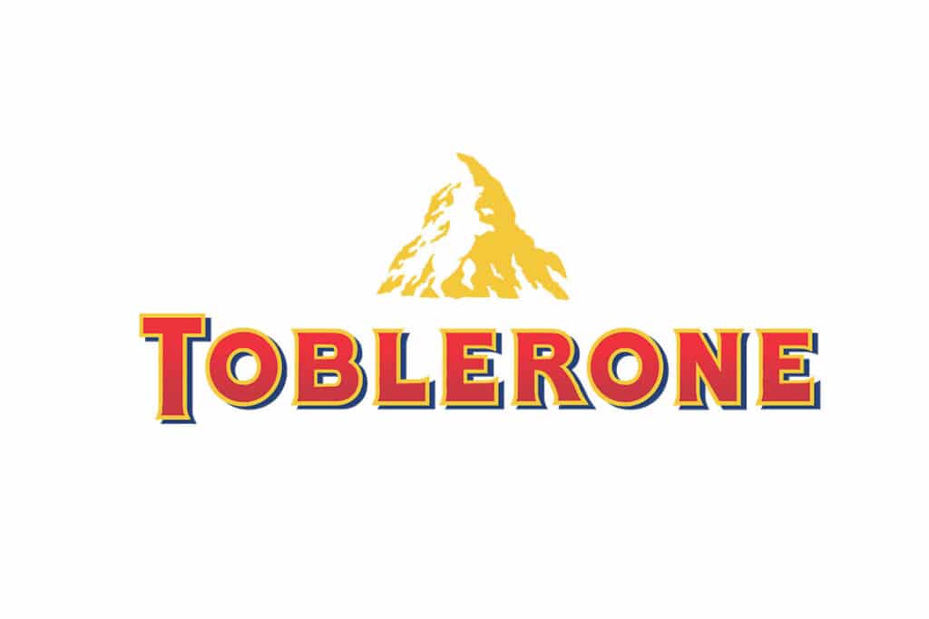
If you never saw it, it’s because you were too busy eating chocolates. This logo pays tribute to its place of origin, the city of Bern in Switzerland, also known as the city of bears because its founder, the Duke of Bertoldo, promised to name it with the name of the first animal that crossed in the middle of a hunt.
Although this is the most popular story, it is believed that the origin of the name could be Celtic. Whatever the origin, what you should not miss is the silhouette of the bear in the middle of the mountains that appears in the Toblerone logo. The Toblerone company was founded in Bern, Switzerland by Jean Tobler.
His son took over the company and it was in 1908 that they first introduced the chocolate bar with the famous triangle shape. The trade name Toblerone comes from a pun on the names “Tobler” and “Torrone”, the Italian word for honey and almond nougat.
In 2000, the Matterhorn Mountain became part of the official Toblerone logo and has since appeared on all Toblerone packaging. The Matterhorn is a great symbol of Switzerland and is even said to possibly be the inspiration for the shape of the chocolate bar. Surely, now that you have seen a bear hidden in the logo, you will tell all your friends about it! This uniqueness makes it an effective logo in consumer’s mind.
4. Logos with hidden meanings: Cisco
The CISCO logo was inspired by the bridges of San Francisco since its inception…. well, its name was also inspired by the name of the city, since it was the city where the company was founded and since then the use of the Golden Gate as an isotype has not been neglected.
As we just mentioned, the most recognizable design element in the logo is the iconic San Francisco city bridge. Although it has undergone some modifications over the years, it still represents the Golden Gate Bridge, incorporating a nod to the digital world, which is reflected in the waves that accompany the lyrics.
The bridge highlights the founder’s heritage and vision of connecting San Francisco with the rest of the world.
The popular Cisco logo has been at the forefront of the company’s strategic marketing campaigns, positioning it as a global giant in networking products. Did you know that Cisco spends 15% of its gross annual revenue on marketing? Well, they have done very well!
Notably, the London 2012 Olympics, the Rio 2016 Olympics, and NBA sponsorships have contributed greatly to the company’s popularity. Still, Cisco’s image has not always been positive, as it has been indicted for issues such as: tax fraud, misleading tax returns, non-compliance with licensing models, and support for the Chinese government.
In any case, the Cisco logo has been of vital importance for the brand to be recognized worldwide.
5. Logos with hidden meanings: Volkswagen

This is one of the logos with hidden meanings that does not hide anything from the naked eye, since the V and the W can be distinguished. Its deep meaning is found in the words that compose it: ” Volks ” and ” Wagen “, both words German words that mean “People” and “Car / Vehicle” respectively. This is one of the emblem types of logo that makes it easily remembered.
In its origins, the project of a car that every German could pay was motivated by the government of Adolf Hitler, since at the time, only 1 in 50 Germans could access a car. Volkswagen used this excuse to build its brand identity.
That was one of the control mechanisms that the Nazi had to compete against foreign brands and thus win the favor of the majority. And it worked quite well, as the cost of the Volkswagen was similar to that of a motorcycle back then , so more than 300,000 Germans were able to afford one.
The name “cars for the people” or “cars of the people” makes a lot of sense in that context, besides that they were functional and very practical vehicles.
The logo design consists of a mixture of two colors: blue and white. The color blue is a symbol of class, superiority and reliability , while white represents the following attributes of the car: pleasant, decent and pure.
Colors and graphic design have a very close relationship , as it is not possible to design without communicating, nor to design without choosing the perfect colors that project what we want to convey. Learn more about the psychology of color and bring excitement to your projects.
6. Logos with hidden meanings: Toyota

Next in the list of logos with hidden meaning is Toyota! The case of the Toyota logo is emblematic because it was one of the ones that took the longest to do. It was requested to celebrate the 50th anniversary of the company , but according to available sources, the development of the logo took 5 years ( and you thought they were demanding too much of you ).
The delay is due to the fact that the company wanted the new Toyota logo to be well accepted in any market, something that they had from experience with the use of their previous logos, since they were very oriental for other countries.
The new logo of the company debuted in the distant 1989, with various meanings that were consistent with the objectives of the brand. The 3 ellipses that make it up represent the heart of the customers and the product, both joined by the main ellipsis. That great ellipse that contains them is the company’s future growth projection. It’s simplicity makes it into one of the greatest logo ever designed.
But that is not all. Did you think that 5 years of development was going to be just to criss-cross ellipses ? If you try to form letters with them you will realize that you can find all the necessary ones to write the word TOYOTA.
The company was named after its founder: Kiichiro Toyoda. However, when the company decided to expand globally and start distributing in European countries, they changed the name to Toyota. When ” Toyota ” is written in katakana (one of the Japanese syllabaries), eight strokes are needed, and eight is a symbol of luck in Asian culture.
The city of Nagoya, where Toyoda was born, has a symbol called maru-hachi, translated as “circle eight.” So number eight also remembers the hometown of the owner and the place where he started his business.
7. Logos with hidden meanings: Lucky Strike
The logo of the famous cigarette brand, in appearance, is only a red circle with superimposed text. Or is it? This is one of the obvious logos with hidden meaning that takes the form of the product itself. Take on the task of seeing it through the eyes of a creative from the 60’s. The graphic designer’s solution couldn’t be simpler and cooler. The red is the fire of the cigar and the white edge the filter . Every time you see the minimalist Lucky Strike logo you’ll be seeing a lit and dissected cigarette.
Next, we will tell you a curious fact about Lucky Strike packaging that you may not have known. In 1944, the president of the company, George Washington Hill, made a bet with the renowned industrial designer Raymond Loewy. It was that he had to improve the design of the green and red package they already had, and offered him $ 50,000 to encourage him to take the challenge .
Loewy eventually changed the background from green to white, thus making it more attractive to women, since by 1944, Lucky Strike was a brand more positioned for men’s consumption (incredible, but true).
In addition to redesigning the packs, they also managed to reduce printing costs by eliminating the amount of green dye. The designer also chose to place the Lucky Strike logo on both sides of the pack, which meant an increase in the visibility and sales of the brand. Hill had no choice but to pay the bet, as both ended up winning in the end.
8. Logos with hidden meanings: Ubuntu
The UBUNTU logo is a reference to the meaning of the name, linked to a well-known ethical rule in South Africa. This rule has a strong connotation of loyalty and camaraderie among members of a community. It even has different Spanish translations like “empatía” or “humildad”.
Ubuntu literally means: ” an ethical or humanistic philosophy that focuses on people’s loyalties and relationships .” As we can see, the logo is a graphic representation of 3 people who are forming a circle with their arms outstretched.
The logo circle is a graphic symbol that represents values such as freedom, collaboration, precision and reliability. This symbol is called the “Circle of Friends” and it has been carefully redesigned and placed within a circle for greater precision and clarity.
9. Logos with hidden meanings: Wikipedia
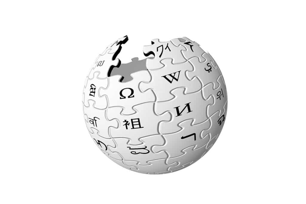
Maybe you never stopped to look closely at this logo, since you were only passing through the page to get information in the shortest possible time. If you see it correctly, you will find the initial letter “W” in different languages.
As you can see, the Wikipedia logo consists of different puzzle pieces that come together and fit together to form a globe. Each piece of the puzzle is printed with a letter and each of them belongs to a different language, symbolizing that Wikipedia collects and imparts information from all over the world.
In addition to this, the world has been shown incomplete because, according to Wikipedia, it shows ” the incomplete nature of the project, the articles and the languages that have not yet been added .” Surely, this logo will undergo further modifications over the years. Even so, it will certainly remain as one of the most recognizable logo in the world.
10. Logos with hidden meanings: Quiksilver and Roxy
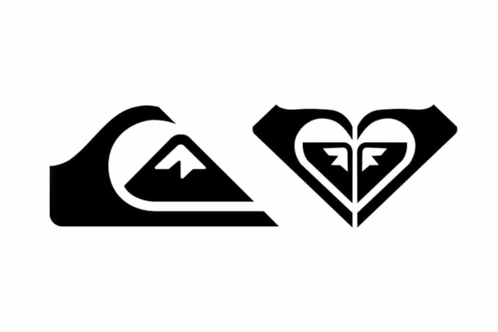
Quiksilver was founded in 1969 by surfer Alan Green in Torky, a city in Australia. It is a place well known for its big waves, and the demand for comfortable clothes was quite high. Surfers from all over the world visiting the Australian city were the first to expand the Quiksilver brand to their countries.
In just one year, the company opened stores in the United States and Europe. In the early 2000s, the head office moved to the United States and in 2017 it moved to Biarritz, France, another birthplace of surfing. Today, Quiksilver has factories in China, Australia, France and the United States.
The brand name translates from English as ” mercury“. This word denotes movement, speed and all the qualities of the metal, which reflects very precisely the philosophy of the brand. The logo Quiksilver was created by the founder himself Alan Green in 1969 and has not changed since.
According to the creator, was very impressed by the painting of the Japanese artist Katsushika Hokusai “the great wave off Kanagawa” This painting (surely you’ve seen) is a historic event. a storm powerful off the coast of Kanagawa, which destroyed the city.
And since the products of the company were related to surfing, Green came up with the image of a wave that covered a great mountain.
also,The ROXY logo is made up of two Quiksilver logos that give it the shape of a heart. The explanation is simple, Roxy is a Quiksilver brand that came on the market in 1990, achieving great popularity for the variety of products launched for women, all under the adventurous spirit of Quiksilver.
Due to the success, in 1993 it was decided to launch a logo that took the style of the main brand to be an emblem of women who practice extreme sports.
Did you already know any of these 10 logos with hidden meanings ? Normally, logos represent the values and attributes of the brand in an abstract and subtle way, trying to generate remembrance in the consumer.
The next time you buy a product or see a brand logo, stop to observe and try to decipher the meaning of its design. It is something very entertaining that will stimulate your analysis skills.
Freelance Graphic Designer Malaysia provides graphic design services in Malaysia for everything including logo! Check out our logo design promo price from time to time for great deals!


0 Comments